After a month here - some thoughts on the site

I've been coming on here once or twice a day for about a month now and thought I'd share a few thoughts on usability from my personal perspective - there's obviously a hell of a lot of work gone into setting this up and keeping it going (including keeping us all protected from spam demons) and its a very polished and professional site, so please take it as read that I really like most of what's here, appreciate you do this at no charge to us and no doubt have plenty of other things to do with your time... so just take this as a bit of feedback on some areas that this user would like to see work a bit differently.
Browsers I use are Win7/IE9, ipad/Safari and iphone/Safari.
1. Font size is too small and this combined with the pink on black doesn't make it easy reading for me - It's kind of OK on the desktop monitor but I really struggle on the iphone. I think in a lot of places you could make the text bigger without increasing the overall size of the screens because there's a lot of blank space between and around lines of text (line spacing).
2. I found the coloured folder icons on the home page confusing for quite a while because it seemed to be saying there were new posts in a whole lot of folders even though nothing had changed since my last visit. it wasn't til I spotted the 'mark all as read' link that I realised the green folder just meant there were some threads I hadn't opened (and am never going to). This may be a first time user problem only, but all I really just want to know is what's new since I last logged in because I'm never going to read every thread here.
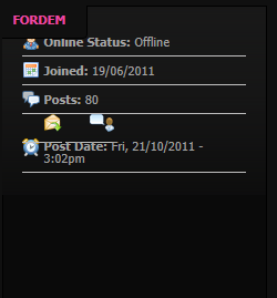
3. The forum home pages have more information than I need (this is connected to 1. - less information would make it easier to read and navigate). I don't personally want to know who created the thread or when, how many have viewed it... just who made the last post and when would be enough. Similarly inside each thread I don't really need to see the full details of each member on every post - often this block of info is much bigger than the post which means the page is much longer than it really needs to be. This info section looks a bit screwy (both Windows and Safari) like this:
4. I wonder if you need as many forums as you have now - conversation gets spread pretty thin around the place. It feels a bit like going to a party in a venue that's much too big for the number of people there - it would be a better party in a smaller room. Perhaps reduce the number down for now (something like technical, driving, buy & sell, general chat/other?) and you can split them up again over time as the number of people grows.
That's all. For now... ;)
Don

Fair points
I'd have to say that this is THE NEATEST forum site I've ever used. Very clean and easy to use (once you hit the 'mark all as read' button).
I would definitely like to see a Trips topic which could include planning and reviews under that.
Overall I am enjoying the forum, thanks to everyone for getting involved.

Thanks for the feedback
Thanks for the feedback guys! I understand your points NZ, most are things I have been looking at changing. ( fingers crossed for some time to work on them this week! )
I agree with bob on the sections tho. In the past I was a fan of just 1 section, but once a forum becomes active its sometimes hard to find an old post you were after if there not sorted well.
I like to keep the sections to a minimum and compared to many other car forums I think I have? IIll add those sections you were after ASAP also. I think it would be fantastic to start getting some regular wheelin days happening.
font
Ignoring the temporarily messed up bits - I like the font size better now, particularly on the iphone. But of course everyone has different devices, preferences and eyesight so thats just my opinion. If you wanted a vote perhaps post a page with a choice of fonts for comparison (time permitting of course ;) )?

font size
i like the new font size. it is a lot more legible and flows a lot better. its so much easier to read, and it doesnt hurt your eyes.
i was at times trying to squint to read the text late at night, as thats the time im usually on coz of work...
whatever happens glen im sure everyone will appreciate everything youve done so far...
Increase sections
I've been on many forums that shrunk back to only a few sections to increase conversation, it resulted in the opposite effect. Too few sections pushes topics down the page quickly and resulted in conversations only staying active while the topic was in the top five in the section.
If possible a ' meetup' section with a sticky post on how to write them up. Trip reviews can also fit in this section giving people the chance to browse through trips photos and reviews easily.
Font is small but my eyes are young so no worries so far.
Thanks glen for creating a fantastic community on here :)
Bob
.